top of page
'EVACARE' BRANDING
BACKGROUND
Whilst working as a Marketing Associate for Sayco Pty Ltd, I was tasked with redesigning branding for its US affiliate 'EvaCare' to be contemporary and modern.
For this project, I had three clients who all lived in different countries. I strived to create branding that all clients were happy with and learned how to communicate effectively to achieve this in a timely manner.
IDEA GENERATION
I started with redesigning the 'EvaCare' logo. I generated a range of ideas and consulted with my clients before moving on to concept development.
I communicated and shared my ideas with the clients regularly to ensure I heard and implemented their feedback.


CONCEPT DEVELOPMENT
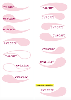
I then moved on to concept development. The logo idea I chose to develop took inspiration from one of 'EvaCare's' unique primary products, drawing on the shape of their distinctive support membrane.
During concept development, I evolved the shape of the logo to represent the product accurately. I also continued with my clients before moving onto concept refinement.


CONCEPT REFINEMENT
During concept refinement, I tweaked the colour of the logo to ensure 'EvaCare' was seen as feminine, whilst still using a similar palette to the previous logo in order to maintain brand recognition.


FINAL LOGO

'EVACARE' PROMOTIONAL & MARKETING MATERIALS
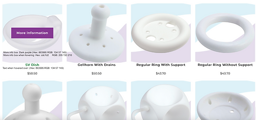
I then adapted elements of the final logo to create promotional and marketing resources in the new branding such as name tags, sizing charts, banners, brochures, the website, etc.
CHARTS

BROCHURE


WEBSITE
NAMETAG

bottom of page